You’re standing in your kitchen, staring at paint swatches, and nothing looks right. Cabinet painting should feel exciting, but right now you’re second-guessing every color combination. Here’s what most homeowners don’t realize: learning how to match cabinet and wall colors isn’t about following rigid rules—it’s about understanding a few proven principles that make the process straightforward.
Your kitchen represents one of the biggest investments in your Batavia home. Getting the colors wrong means living with a space that feels off every single day. But when you get it right? You’ll have a kitchen that feels custom-designed, increases your home’s value, and makes you actually want to spend time cooking.
Key Takeaways
Why Most Homeowners Struggle to Match Cabinet and Wall Colors
Walk into any paint store in Batavia and you’ll find thousands of color options. The problem? How to choose cabinet paint colors becomes overwhelming when you’re staring at that many choices.
Most homeowners make one of three mistakes:
The result? Cabinets and walls that clash, making your entire kitchen feel disjointed.
The 60-30-10 Rule: Your Foundation for Kitchen Color Coordination Tips
Professional designers use this rule in every project. Here’s how it works:
This creates natural balance. Your eyes can rest. Nothing fights for attention.
For most Batavia kitchens, this means choosing a neutral wall color that covers the largest surface area, then selecting cabinet colors that complement without competing. Your countertops, backsplash, and hardware provide those accent pops.
How to Match Cabinet and Wall Colors Using Undertones
Every paint color has an undertone—the subtle hint of color beneath the surface. Miss this, and your carefully chosen colors will look wrong together.
Here’s what to look for:
The biggest mistake? Mixing warm cabinets with cool walls, or vice versa. They’ll clash every time.

Testing Colors in Your Actual Space
Paint chips lie. That small square in the store will look completely different on your wall.
Here’s the right way to test how to match cabinet and wall colors:
Batavia homes get distinct natural light patterns. North-facing kitchens receive cooler, more consistent light. South-facing kitchens get warmer, changing light throughout the day. Your color choices need to work in all these conditions.
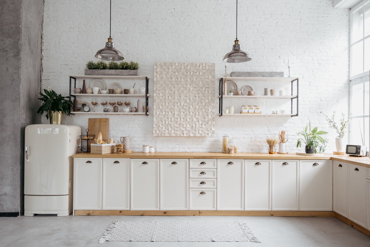
Popular Cabinet and Wall Color Combinations That Work
While kitchen color coordination tips can feel abstract, some combinations have proven track records:
| Colors to Consider | Pair with | Why it works | Watch out for |
|---|---|---|---|
| Classic White Cabinets | Soft gray, greige, or pale blue walls | White cabinets are neutral enough to handle almost any wall color | Stark white cabinets with bright white walls—the space will feel sterile |
| Gray Cabinets | White, cream, or soft taupe walls | Gray is sophisticated but needs lighter walls to prevent a cave-like feel | Matching the exact same gray—add contrast or the room will feel flat |
| Navy or Dark Blue Cabinets | Crisp white or warm cream walls | The contrast creates drama without overwhelming the space | Dark walls with dark cabinets—you’ll lose all definition |
| Green Cabinets | Warm white or soft beige walls | Green feels fresh but needs neutral walls to stay grounded | Competing greens—if your cabinets are sage, don’t go olive on the walls |
How Your Cabinet Finish Affects Wall Color Choices
The finish you choose for cabinet painting changes everything about how to match cabinet and wall colors.
Matte finishes absorb light. They make colors look deeper and richer. If you’re going matte on your cabinets, you can typically handle bolder wall colors because the cabinets won’t reflect competing light.
Glossy finishes reflect light. They make colors look brighter and more intense. Glossy cabinets need softer, more neutral walls or the space will feel too busy.
Satin or semi-gloss finishes sit in the middle. They’re the safest choice for most Batavia homeowners because they balance durability with visual appeal.
Working With Your Existing Features
Your cabinets and walls don’t exist in a vacuum. They need to work with everything already in your kitchen.

The Role of Natural Light in Batavia Kitchens
Batavia’s seasonal light changes dramatically. Summer brings bright, warm light. Winter light is cooler and less intense.
If your kitchen gets limited natural light, avoid dark cabinets with dark walls. The space will feel cramped. Instead, use lighter wall colors to reflect available light, even if you choose darker cabinets.
For sun-filled kitchens, you have more flexibility. Just remember that intense afternoon sun can make colors look washed out. Test your samples during peak sunlight hours.
Common Mistakes When Matching Cabinet and Wall Colors
After working with hundreds of Batavia homeowners, we’ve seen these mistakes repeatedly:
How to Choose Cabinet Paint Colors That Last
Trends change. Your cabinets need to look good for years.
Stick with these principles when learning how to choose cabinet paint colors:
Your Kitchen Color Coordination Checklist
Before you commit to how to match cabinet and wall colors, run through this checklist:
list-style: none;
padding: 0;
max-width: 700px;
margin: 20px auto;
font-family: Arial, sans-serif;
color: #333;
}
.checklist li {
display: flex;
align-items: flex-start;
margin-bottom: 15px;
font-size: 1.05rem;
line-height: 1.5;
background: #fff;
border-radius: 10px;
padding: 12px 14px;
box-shadow: 0 1px 4px rgba(0, 0, 0, 0.08);
transition: transform 0.2s ease, box-shadow 0.2s ease;
}
.checklist li:hover {
transform: translateY(-3px);
box-shadow: 0 3px 8px rgba(0, 0, 0, 0.12);
}
input[type=”checkbox”] {
appearance: none;
min-width: 22px;
min-height: 22px;
border: 2px solid #121684;
border-radius: 5px;
margin-right: 12px;
cursor: pointer;
position: relative;
transition: background-color 0.25s ease, transform 0.1s ease;
}
input[type=”checkbox”]:hover {
transform: scale(1.1);
border-color: #0e0f75;
}
input[type=”checkbox”]:checked {
background-color: #121684;
}
input[type=”checkbox”]:checked::after {
content: ‘✔’;
position: absolute;
color: #fff;
font-size: 15px;
left: 4px;
top: 0px;
}
@media (max-width: 600px) {
.checklist li {
font-size: 1rem;
padding: 10px 12px;
}
input[type=”checkbox”] {
width: 20px;
height: 20px;
margin-right: 10px;
}
}
- Have you identified the undertones in both your cabinet and wall colors?
- Have you tested samples in your actual kitchen in different lighting?
- Do your colors work with your countertops, floors, and backsplash?
- Have you applied the 60-30-10 rule to create balance?
- Have you considered how the cabinet finish will affect the overall look?
- Are you choosing colors you’ll love in five years, not just today?
- Have you gotten feedback from family members who use the kitchen?
The Real Cost of Getting Colors Wrong
Here’s what most homeowners don’t consider: fixing a color mistake costs significantly more than getting it right the first time.
If you need to repaint cabinets:
Getting kitchen color coordination tips from experienced professionals and taking time to test properly costs nothing extra. Rushing the decision costs thousands.
Ready to Get Your Cabinet and Wall Colors Right the First Time?
You’ve done the research. You understand how to match cabinet and wall colors. Now you need a team that can execute your vision with precision.
At A&A Painting, Inc, we’ve helped hundreds of Batavia homeowners transform their kitchens with professional cabinet painting that lasts. We’ll help you test colors, avoid expensive mistakes, and deliver a finish that makes your kitchen feel brand new.
Stop second-guessing every color choice. Call us at (630) 874-0072 and let’s create a kitchen you’ll love for years to come.