How to Create a Cohesive Color Scheme in the Home?
Key Takeaways

Why Most Homeowners Struggle with Color Flow
Here’s a common scenario in South Elgin homes: You fall for a bold blue in the bedroom, choose a warm beige for the hallway, and settle on a cool gray for the living room. Each choice seems logical on its own. But when you look at the spaces together, they just don’t connect.
It’s not that you picked the wrong colors. The issue is picking them without an overall plan.
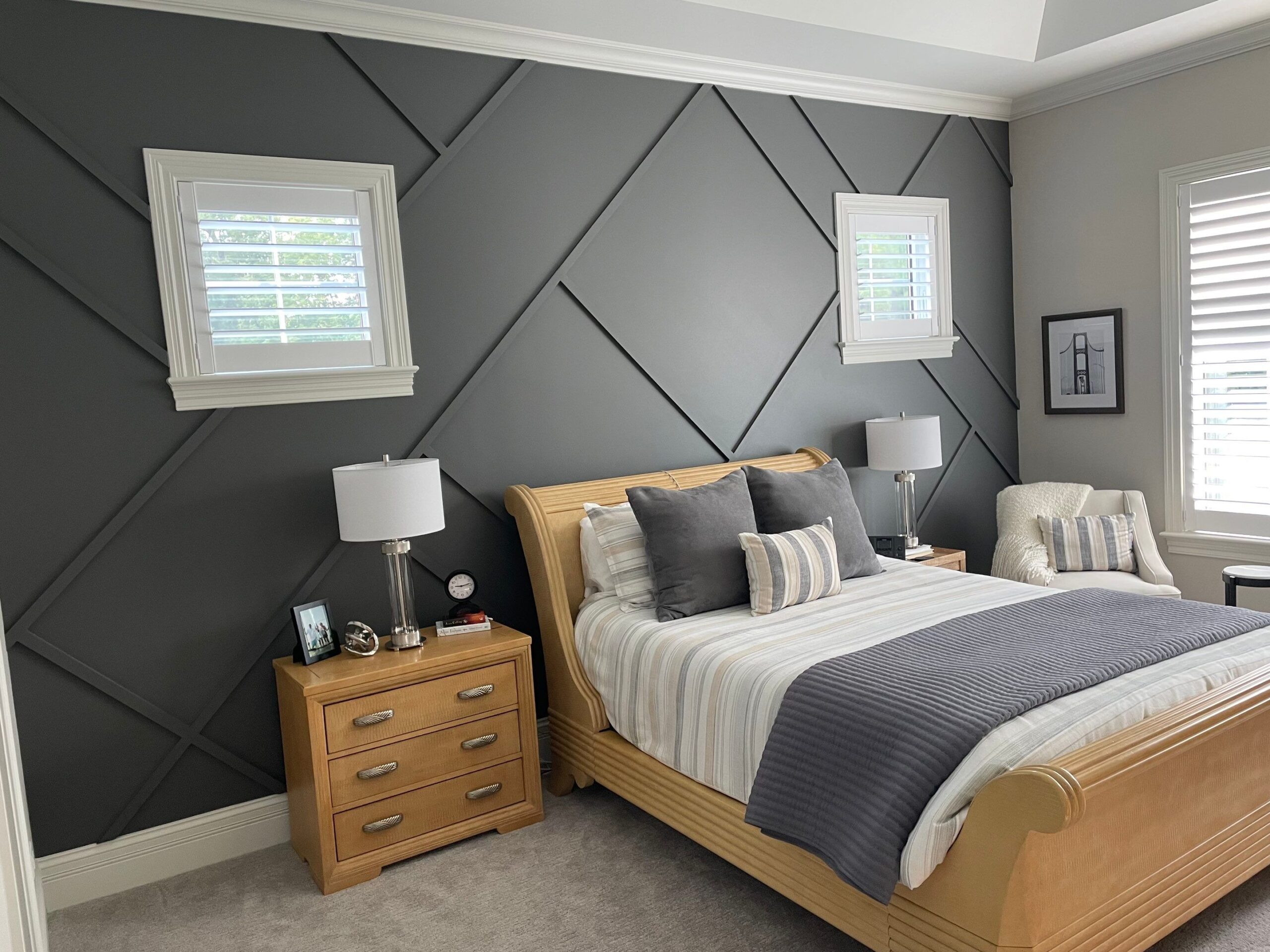
Professional interior house painting projects start with the whole house in mind. When you learn how to create a cohesive color scheme in home spaces, you’re not just painting walls. You’re creating a visual story that unfolds as people move through your space.
Understanding the 60-30-10 Rule
When you apply this rule to interior house painting across your entire home, something magical happens. Every room feels unique, but nothing feels out of place. The dominant color creates continuity, the secondary adds rhythm, and the accent provides punctuation.
The Critical Role of Undertones
Here’s where many DIY interior painting projects miss the mark: undertones.
Every paint color has an undertone, the subtle hue beneath the surface color. A gray might have blue, green, or purple undertones. A beige might lean pink, yellow, or gray. When your undertones clash, your whole color scheme falls apart, even if the colors technically “go together” on a color wheel.
South Elgin homeowners need to pay special attention to undertones because our Midwest light can affect paint colors. Northern Illinois gets a mix of bright summer light and gray winter days, which means your paint colors will shift throughout the year.
The solution? Test your paint samples in multiple rooms at different times of day. Paint large swatches (at least 2 feet by 2 feet) on walls in each room you plan to paint. Look at them in morning, afternoon, and artificial evening light. You’ll quickly see which colors share undertones and which ones fight each other.
When you’re working to create a cohesive color scheme in home spaces, matching undertones is more valuable than matching exact colors. A warm white with yellow undertones will flow beautifully into a soft beige with the same yellow base, even though they’re technically different colors.

Tackling Open Floor Plans
Open floor plans present a unique challenge for interior house painting because you’re looking at multiple “rooms” simultaneously. What works in a closed-off bedroom won’t necessarily work when your kitchen, dining room, and living room all share visual space.
The trick to creating a cohesive color scheme in home layouts with open concepts is treating the entire open area as one large room, even if you want to define different zones.
Use your dominant color on most walls throughout the open space. This creates unity and makes the area feel larger. Then, use your secondary color to define specific zones. Maybe the kitchen has an accent wall in your secondary shade, or you paint the dining area alcove in a slightly darker tone of your dominant color.
Avoid the temptation to paint each zone a completely different color. This chops up your space, making it feel smaller and more chaotic. Instead, let furniture, lighting, and subtle color variations define your zones while maintaining that crucial visual flow.
Many South Elgin homes feature beautiful open-concept designs, and the most successful interior house painting in these spaces creates definition without division. Think of it like music: you want different instruments, but they all need to play in the same key.
The Science of Color Transitions in Hallways
Hallways are the unsung heroes of creating a cohesive color scheme in home design. These connector spaces set the stage for every room they touch.
Here’s a principle professional painters follow: hallways should be painted in your dominant neutral. Why? Because hallways frame the doorways to other rooms, a neutral hallway serves as a reset button between spaces.
When you walk from a bold navy bedroom through a neutral hallway into a soft sage bathroom, your eye gets a break. The hallway acts as a buffer, making the color change feel intentional rather than jarring.
But there’s an exception: if your hallway is long or dark, consider using a slightly lighter shade of your dominant color. This brightens the space and prevents the tunnel feeling that narrow hallways can create.
South Elgin homes built in different eras have different hallway configurations. Older homes might have several short hallways connecting rooms, while newer construction often features a central hallway hub. Regardless of layout, keeping hallways in the neutral family creates that flow you’re after.
Lighting: The Hidden Variable
You can follow every rule for creating a cohesive color scheme in home spaces, but if you ignore lighting, your carefully planned palette will still fall flat.
Different rooms in your South Elgin home receive different quality and quantity of light. North-facing rooms get cool, indirect light. Colors appear slightly darker and bluer there. South-facing rooms get warm, direct light, making colors lighter and more yellow. East-facing rooms are bright in the morning. West-facing rooms glow in the afternoon.
This is why interior house painting professionals always test colors in the actual rooms where they’ll be used. That perfect gray you loved in the paint store might turn flat and lifeless in your north-facing bedroom, or it might look completely different in your sun-soaked living room.
Compensate for lighting by adjusting your color temperature. In rooms with cool northern light, choose slightly warmer shades. In rooms with warm southern exposure, you can go a bit cooler. This balance helps colors feel consistent even when the light quality changes from room to room.
Also, think about artificial lighting. LED bulbs, incandescent bulbs, and fluorescent lights all cast different hues. Most South Elgin homes now use LED lighting, which tends to run cool. If your home uses warm-toned LED bulbs, your paint colors will appear warmer than they do in daylight.
Working with Existing Elements
Let’s be realistic: you’re probably not replacing your flooring, countertops, and built-ins every time you repaint. Learning how to create a cohesive color scheme in home spaces means working with what you already have.
Start by identifying the fixed elements in your home that aren’t changing. These elements should inform your color choices, not fight against them. If you have honey oak floors, choose paint colors with warm undertones for a harmonious look. If you have cool gray tile, stick with colors that have blue or green undertones.
This doesn’t mean your fixed elements dictate everything. It just means they need to be part of the conversation. Many South Elgin homes have beautiful wood trim, stone fireplaces, or unique architectural details that can actually inspire your color palette rather than limit it.
Professional interior house painting first takes inventory of these elements, then builds the color scheme around them. It’s like dressing for a statement piece of jewelry – you wouldn’t wear a silver necklace with gold earrings, and you wouldn’t paint warm peach walls next to cool gray tile.
The Power of Paint Finish
Here’s something most homeowners don’t realize: the finish of your paint affects color transition as much as the color itself.
Flat or matte finishes absorb light, making colors appear deeper and more muted. They’re perfect for hiding wall imperfections, but can make a room feel smaller. Eggshell and satin finishes reflect some light, making colors appear slightly brighter and more vibrant. Semi-gloss and gloss finishes bounce a lot of light around, making colors look lighter and more intense.
When you’re planning interior house painting to create a cohesive color scheme in home spaces, consider strategically varying your finishes. You might use flat paint in your bedroom for a cozy feel, satin in your living areas for durability and a slight sheen, and semi-gloss in your kitchen and bathrooms for moisture resistance.
The finish changes act as subtle transitions between spaces without requiring different colors. A hallway in satin finish leads into a bedroom in flat finish, and even though they’re the same color, the change in light reflection creates a gentle visual shift.
Most South Elgin homes benefit from keeping trim and doors in a consistent finish throughout (typically semi-gloss white), which creates continuity even when wall colors change.
Creating Visual Flow with Sightlines
Stand in your home’s main entrance and look around. What do you see? Every visible space from a single vantage point needs to work together.
This is where the interior house painting strategy gets specific. Those sightlines determine which rooms must share color relationships. Your entryway might look into the living room, down the hallway, and up the staircase all at once. These three spaces need color harmony, even if they’ll eventually be different shades.
Walk through your South Elgin home and identify all the major sightlines. From the kitchen, can you see into the dining room and living room? From the top of the stairs, are you looking down at three different hallway colors? These viewpoints show which spaces need the most color coordination.
A simple way to test sightlines is to take photos from various positions in your home. When you review the images, you’ll clearly see which walls appear together in the frame. Those are the walls that need to share undertones or color families when you create a cohesive color scheme in home layouts.
Why Professional Help Makes Sense
Look, you can absolutely learn how to create a cohesive color scheme in home spaces on your own. But there’s a reason interior house painting professionals spend years developing their eye for color relationships.
Professional painters in South Elgin have seen thousands of homes and know what works in our specific lighting conditions and architectural styles. They understand how paint colors will dry and how they’ll look in six months, not just the day they’re applied. They know which paint brands offer the truest colors and which formulas hold up best in our Illinois climate.
More importantly, professionals can help you avoid costly mistakes. That $200 you spend on a color consultation is nothing compared to the $2,000 you’d waste buying paint for your entire house in the wrong colors, then having to repaint everything.
When you hire experienced painters, you’re also getting interior house painting execution that ensures your carefully planned color scheme looks as good on the walls as it does on paper. Clean lines, proper coverage, and attention to detail make even basic colors look expensive.
Ready to Create Your Perfect Color Flow?
Choosing paint colors that actually work together isn’t guesswork. It’s a skill that combines art, science, and experience. If you’re ready to stop second-guessing your color choices and start loving how your South Elgin home flows from room to room, A&A Painting, Inc can help.
Our team has helped hundreds of local homeowners create cohesive color schemes for their home spaces that reflect their style while avoiding the costly mistakes that come with DIY color selection. We’ll work with you to understand your vision, assess your home’s unique lighting and architectural features, and develop a paint plan that creates the seamless flow you’re looking for.
Don’t spend another day living with color chaos. Call A&A Painting, Inc at (630) 874-0072 to schedule your color consultation. We’ll show you exactly how to create a cohesive color scheme in home layouts that makes your entire house feel like it was professionally designed – because it will be.